The Project
I storyboarded, designed and animated this explainer video for the Bermuda app, which lets users rent boats as they would an Uber. The goal was to inspire people to think about boating in a new way--or to think about it for the first time, since so few people regularly boat. Veering away from the idea that boating is only for the leisured rich, the video uses bright, jewel-toned colors (based on the brand's color palette), playful characters and lots of camera movement to express the joy, ease, flow and informal fun of the app and boating. The project was done as the final animation I did for School of Motion's Explainer Camp course.
The Brief
Bermuda bills itself the "Uber of Boats." Essentially, the app lets users easily rent boats and even lets them choose a driver, or captain, in case they don't know anything about sailing. As the company states in its brand ethos statement, "We don't think the boating experience should be limited to the wealthy."
Research and Goals
It's safe to say that most Americans don't think about boating as a possible weekend activity. According to the U.S. government's National Recreational Boating Safety Survey, only about 12% of U.S. households own a recreational boat, yet more than 50% of the population lives within 50 miles of a coastline. Moreover, only 36% of those who own boats take them out on the water each year (data are from 2018, pre-pandemic). In other words, more than 60% of boats are not being used.
Part of the challenge of encouraging more boating is broadening access. Boat owners are disproportionately wealthy and predominately white; according to the same NRBSS data, fewer than 1% of boat owners in the U.S. are Black and fewer than 5% are Hispanic, even though coastal metropolitan areas represent some of the most ethnically diverse regions of the country.
An app like Bermuda has the potential to help democratize boating, so its promotional campaign had to counter ingrained ideas about who boats. To that end, I aimed to design an informational ad that emphasizes that boating is fun, easy and available to everyone. The goal was to reach people who may have never considered boating before, and plant the idea that renting a boat for a weekend afternoon could be a fun and possibly romantic adventure.
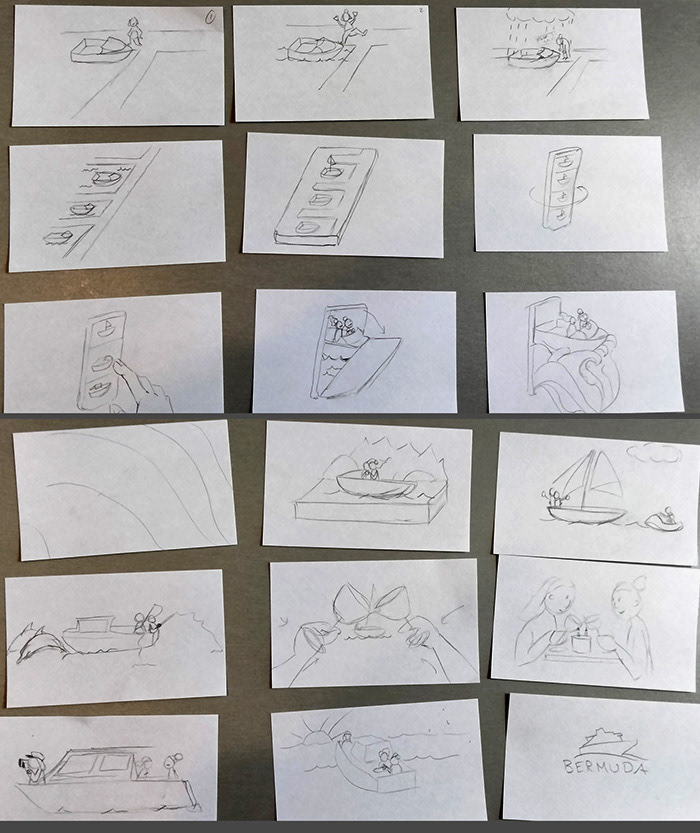
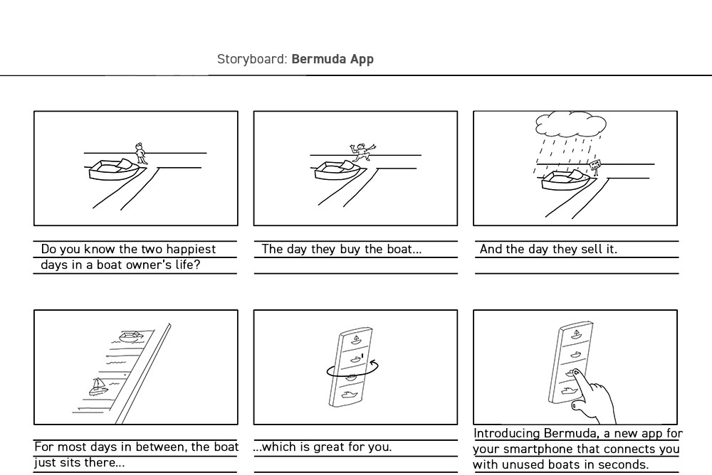
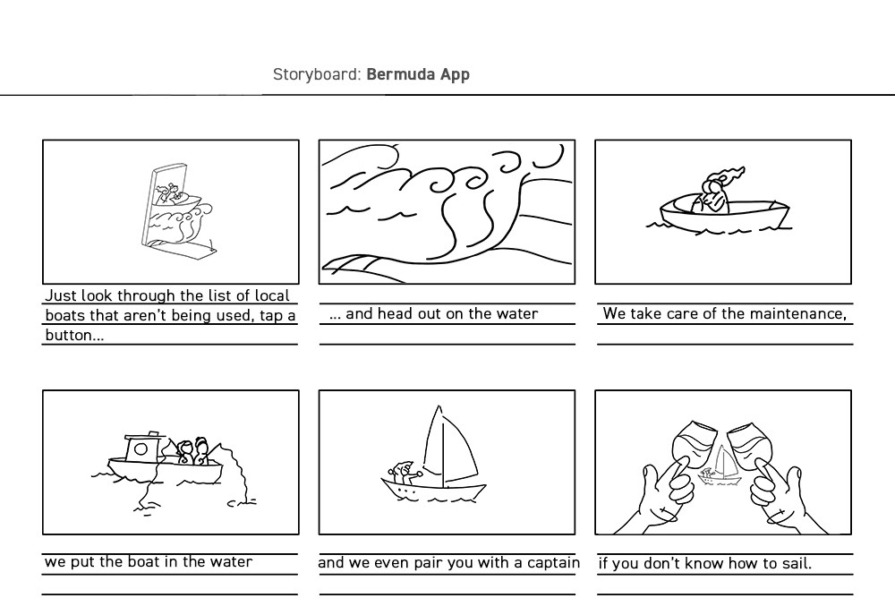
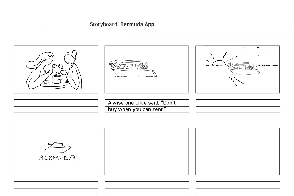
Moodboards, Thumbnails, Storyboard and Animatics
I created several moodboards for the direction of the animation but settled on the low-poly 3D style sampled above. Although 3D can be a challenge to pull off in terms of time constraints, the characters didn't need to speak or show too much movement, so I thought stylized characters would be a good fit, though perhaps a challenge too.
I first sketched thumbnails on index cards (which lets me quickly revise, reorder and discard the duds) and then drew the storyboards in Photoshop. Several potential problems became apparent when doing the animatic. First, because of the script's timing, I had to revise the idea of using a cloud to illustrate one of the downsides of owning rather than renting a boat. I redid that sequence to show the boat being covered with a tarp.
Second, the latter half of the storyboard showed the couple in various boats in the middle of the screen while the boat changed around them. That came across as too slow for the kinetic, flowy and fun mood that this new app deserved, so I introduced energy with sweeping camera movements that carry the viewer through a range of storybook-like scenes--essentially each scene shows a different kind of boat and a potentially different way to enjoy the weekend.
The storyboards in an animatic (left). Once the storyboards were approved, I created style frames (right) and updated the animatic.
Landscapes, Boats and Characters
The unspoken motto in the video is "Choose your own adventure." Even if you do own a boat, renting offers you the freedom to explore new lands and new activities. The couple upscales their adventure throughout the video. They start in a speedboat by shooting out of the phone on a roller-coaster wave of water meant to highlight the exhilaration and freedom offered by the app. Then they're fishing in a serene, violet land before they upscale to a sailboat steered by a captain. The couple end up on a yacht, going all out for a weekend celebration.
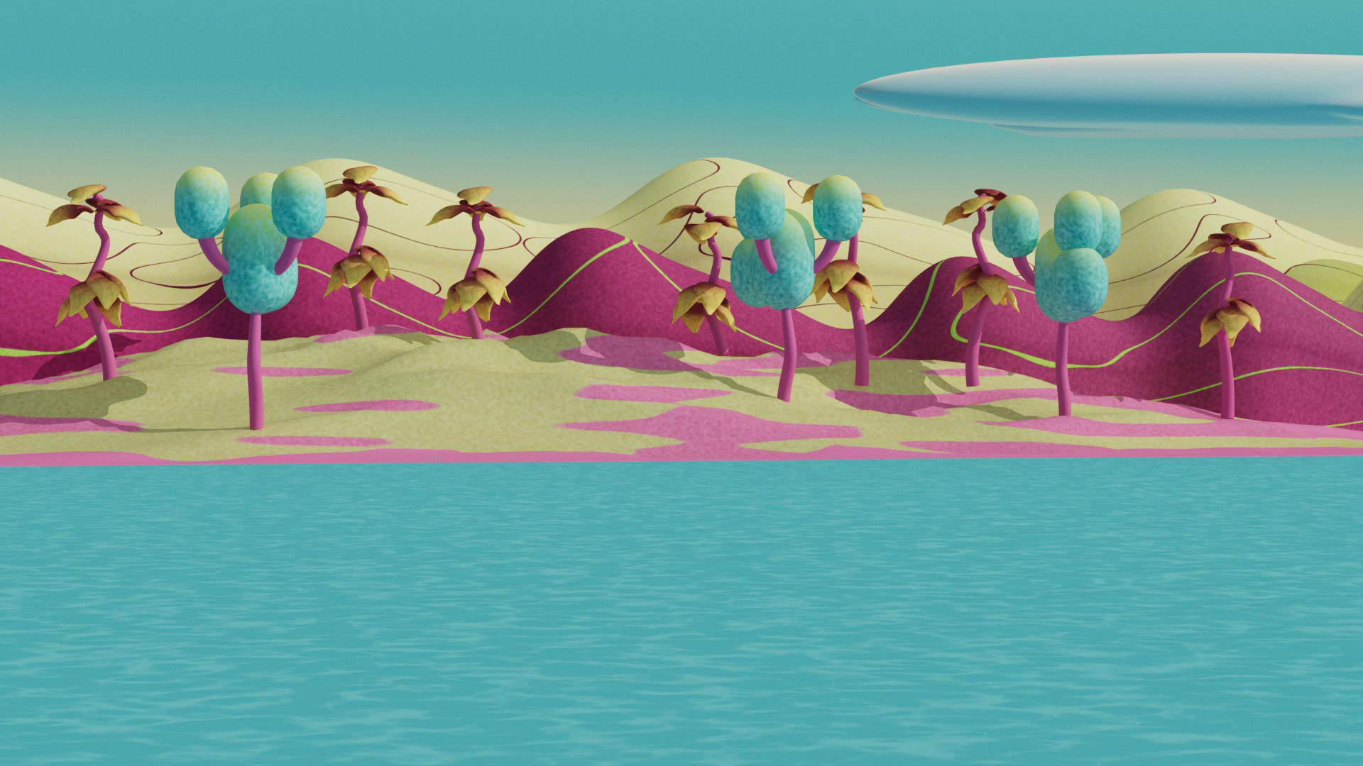
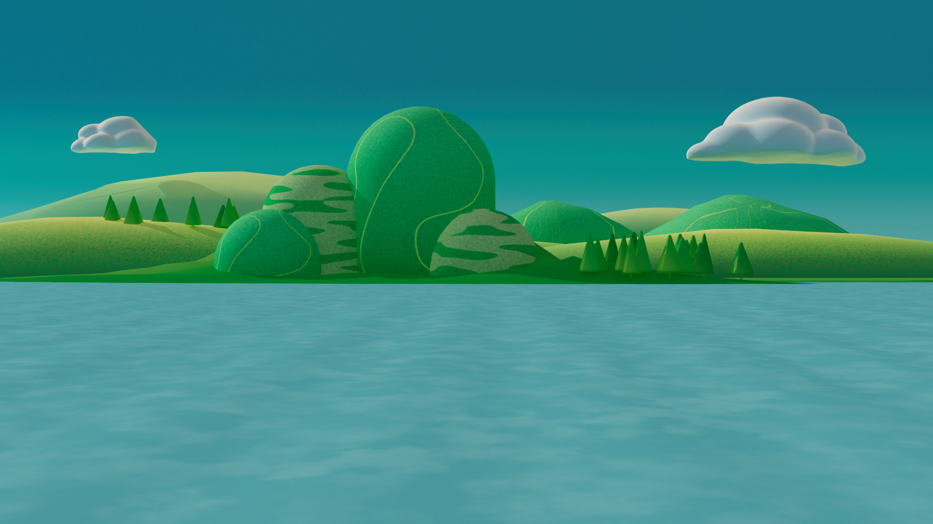
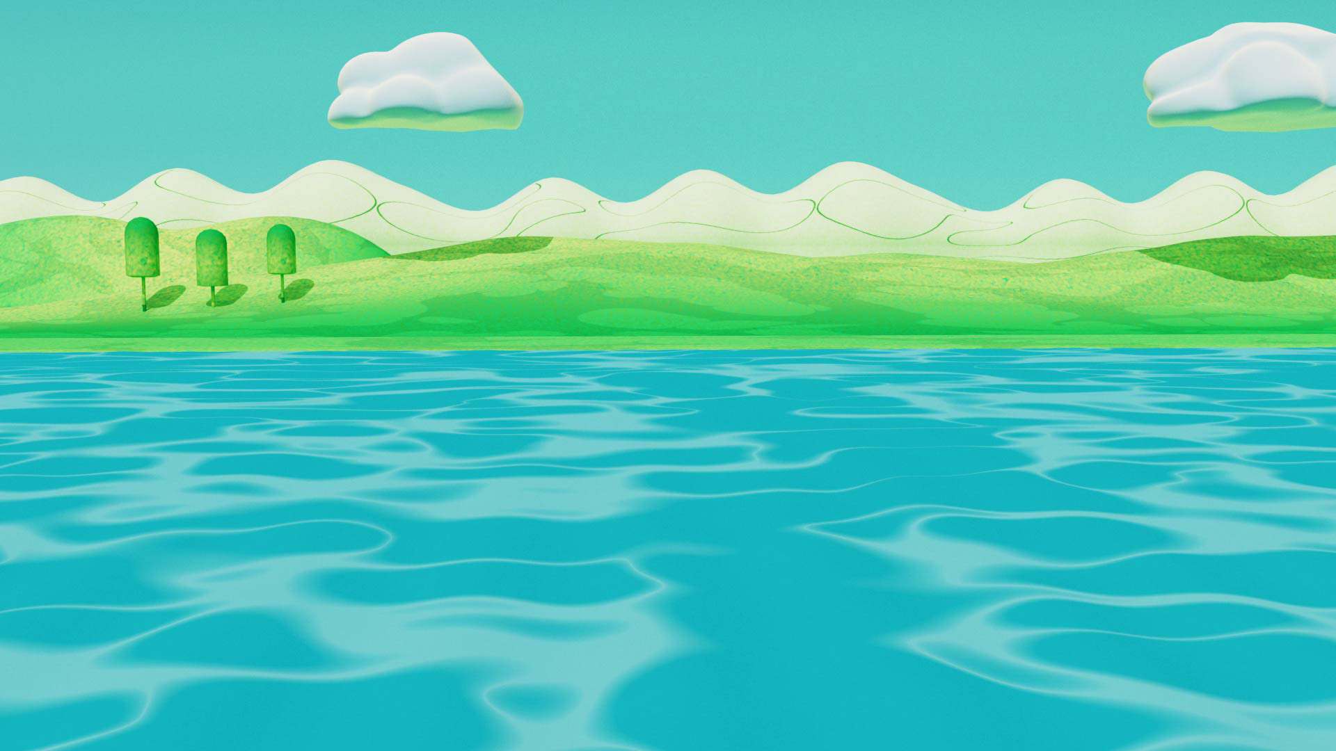
The characters were built and rigged in Cinema 4D. Though the base meshes were similar, I needed to change the clothes (and mesh weighting) of the characters as they upscaled to better boats, so several characters had more than one model. The boats were meant to be toylike, so they had soft curves and storybook accent colors. The video was composited and partly animated in After Effects. I designed the supporting illustrations (app icons, some clouds and sky backgrounds) in Photoshop and Illustrator.
The brand had not fully implemented the app and was still wireframing the UI, so I needed to hint at how the app would operate without suggesting that this was the final app design. To underscore the informal, approachable identity we wanted to achieve, I sketched boats in Illustrator for the icons (each sketch corresponds to a 3D boat I built for the animation) and then animated the UI in AE. The contrast between the sketchy, charcoal-line drawings and the 3D animated boat that pops out of the phone is meant to surprise the viewer and hint to users that they are being offered the opportunity to enter a new world of boating adventure.